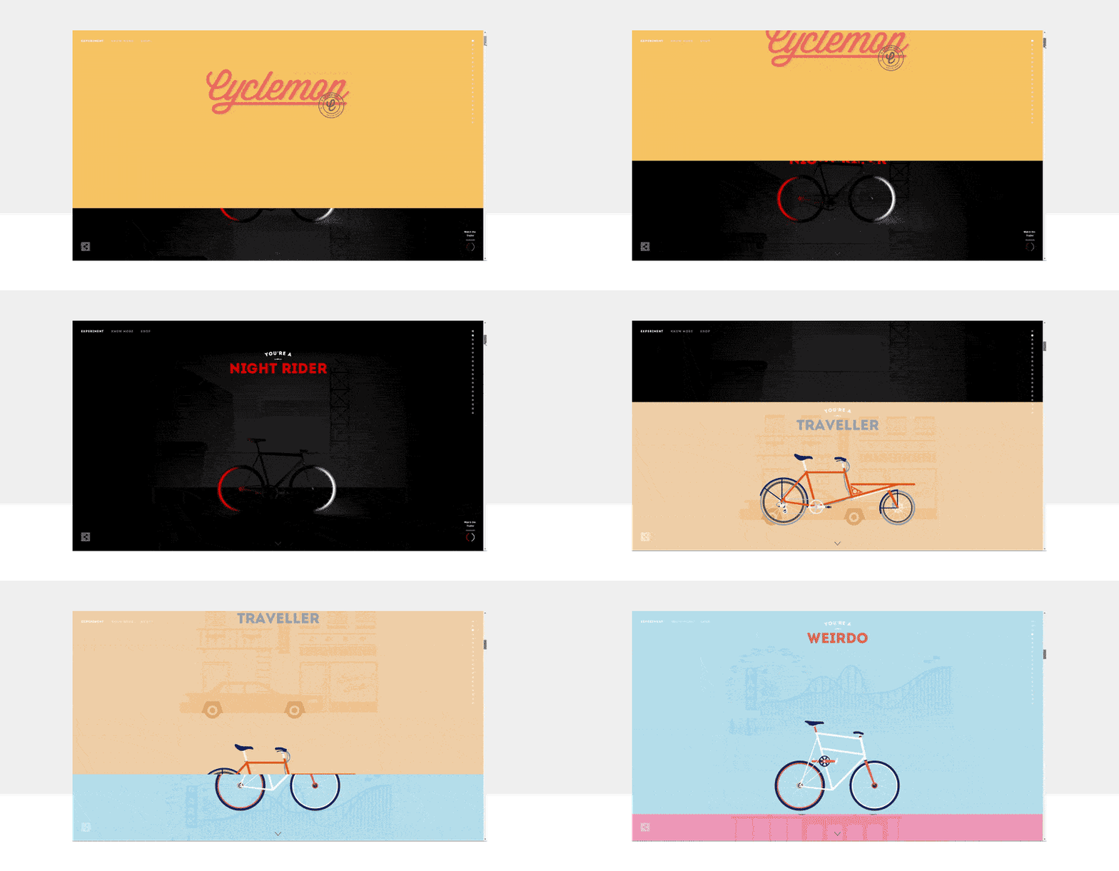
When it comes to website design, the creative direction a designer can take is near-limitless. But one concept in particular—parallax scrolling—has become a widespread and popular design choice.
Surprisingly, the parallax effect has been around for much longer than you may realize. Video game designers in the late 80s and early 90s used parallax scrolling as a less resource-intensive solution to add depth to 2D video games. Now, its use has evolved into a fun, interactive way to engage website visitors.
Parallax scrolling is a design mechanic where the foreground and background move at differing speeds for the sake of adding depth, dimension, and motion as the viewer scrolls through the website. For example, a website could simulate the feeling of flying through a gap between mountains. Mountains in the foreground would move closer faster than mountains in the background would.
However, parallax scrolling doesn’t have to be as complicated as that. It can also be as simple as bubbles floating upwards, passing over text every now and then. Its use, impact and prominence is at the discretion of the designer.

Parallax scrolling has become a popular design aesthetic, particularly for websites, because it is:
- Engaging: Parallax websites responding to the visitor as they scroll through the website.
- Novel: Surprisingly, there are a lot of people who have yet to see a parallax website. The ‘wow’ factor for these designs are just as strong as they were before.
- Unique: Despite its growing prominence, designers are still finding new and creative ways to implement parallax for their clients. We’re excited to see what the future has in store!
Want to see some unique parallax scrolling websites? Take a look at this blog post here. What’s your favourite website from this list? Let us know in the comments below!
Have your own parallax scrolling idea you’d like on your website? Let us know on our contact page if you’d like us to bring it to life!

